Here what is intended is to make a graph that connects period with magnitude.
This graph is made approximately with the data of about 500 Cepheids extracted from the University of Toronto. I used Excel to make the graphic.
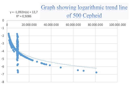 In addition to the graph, thanks to excel we can know the equation with which all the variables are calculated. With this, more graphs could be made with the same base but different data.
Despite the apparent simplicity, with this formula you can get really interesting data when doing research.
After doing all this things, I could do more graphics with other cepheids and using similar formulas, but I had problems with R (the programme to do the graphics) so I decided not to continue.